UAE PAVILION | EXPO 2020
UAE Pavilion Expo 2020 | Brand Identity
Following the UAE Pavilion’s foundational and strategic story — Ours is a story of dreamers who do. Of the builders of this nation — both Emiratis and residents. Of ambitious people who understand the value of investing in human connections. Of authentic people who remain true to our customs and faith, while welcoming those who share our values. Of resilient people, who can weather the most difficult situations while remaining optimistic. Underpinning the rapid progress of our nation are the values that guide our growth. We offer new hope for the region and model a new way forward for the world.
Through collaborative research and strategy creation with teams like Brand Consultants – SYPartners, and Brand Research, Curation, and Storytelling by – Lest We Forget, we came up with the brand story that drove the whole of the UAE Pavilion branding, experience and applications.
A brand that was designed to reflect the ambition and authenticity of the UAE, the UAE Pavilion brand story and system go beyond creating a logo, tagline or advertising campaign. The system was established to create a sensorial brand that looked into having its values represented in the full experience of the Pavilion; from designing brand sonic, to scent, to graphics and visuals, to experience, and to food.
The logo mark is a creative expression of the UAE – Land of Dreamers Who Do – capturing the distinctive character of this nation where leaders manage the tension between the core values of ambition and humanity. The ripple effect that radiates from the center of the logo embodies the nation’s hope for the region and its invitation to each of us to pursue our dreams and in doing so, touch lives beyond our own. The Arabic type in this logo reads Emirates, Arab, United from the center. It is constructed within a balanced mono-spaced grid, leaving it with equal spacing between the negatives and the positives, making it marked and timeless.
Client | Ministry of Presidential Affairs, SHF [Salama Bint Hamdan Al Nahyan Foundation]
TINKAH | 2019-2021
A neutral color scheme was selected for the primary formal brand language. A spectrum of tone on tone stone shades with contrasting black and accent color shades, in reference & respect to the people, land, & crafts of the UAE was used to maintain the humble & raw aspect of the brand's visual communication system. In order to maintain a sophisticated language, we encouraged the use of material with its raw and natural aesthetics, playing with textures and surfaces through techniques such as blind embossing, foiling, and layering as finishes and techniques.
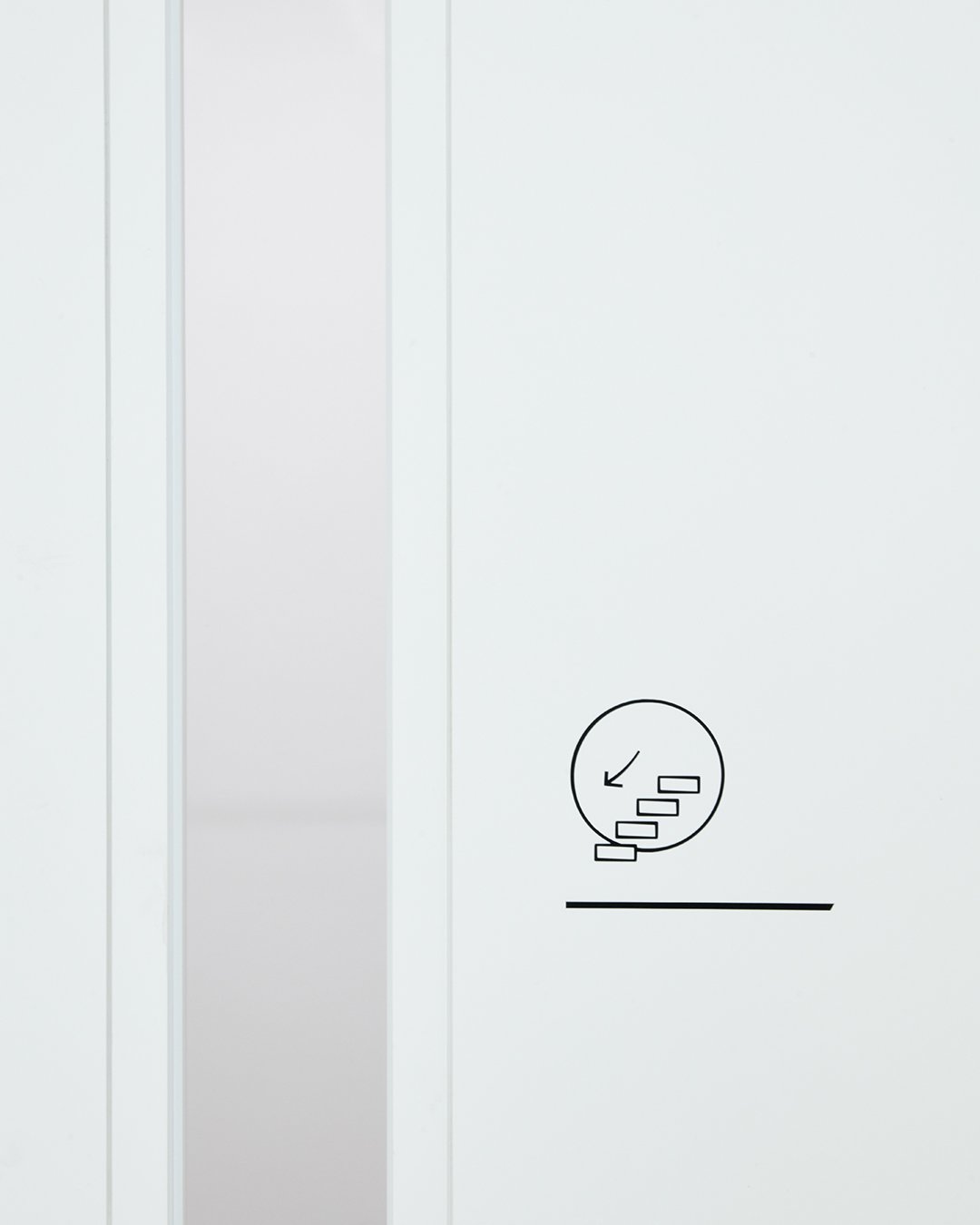
A set of pictograms were designed for the way-finding and signage of the UAE Pavilion on site at Expo 2020. The pictograms share similar properties with the brand and needed to convey the authenticity of the UAE while being in line with the UAE Pavilion brand guidelines taking into consideration the organic thickness inspired by the logomark, the stroke element present in the brand, as well as keeping the circle element as a constant. A grid system was designed to ensure consistency across the pictogram family, where the black stroke of the pictograms contrasted with the bright white background of the UAE Pavilion walls and facades. The pictograms are recognizable from a distance due to the minimalist look and feel of the space and the play of contrasts with the white sterile surrounding.
CREDITS AND COLLABORATIONS
Brand Story, Identity, Applications, and Pictograms | Tinkah Team [Kholoud Sharafi, Ranim Al Halaky, Claudia Rivera]
Brand Sonic application | Why Do Birds
Fonts | Zarid Sans by 29Letters for the Arabic type & Akzidenz Grotesk Std by H.Berthold Typefoundry for the Latin type. Accompanied by Expo2020Dubai fonts.
Brand Consultants | SYPartners
Brand Research, Curation, and Storytelling | Lest We Forget
Architect | Santiago Calatrava
Website Development | Think Moto
Visitor Experience Designers | KDJT — Kossmanndejong and Tellart
To bring the brand to life in a contemporary manner, a secondary system was established to reflect the exhibit of the UAE Pavilion at Expo 2020. This adaptation is inspired by 5 key pillars and experiences that were represented within the exhibition space of the pavilion. Based on the experience narrative, we built a timeless system that allows for the brand language to evolve. Looking at the past, present, and future, this system was portrayed using the monotone overlay to project a conversation between two visuals from the past and the present, while highlighting textures of land from the UAE. The technique of overlaying and the use of transparency were the key stylistic elements, in addition to a specific color palette, patterns, textures, and compositions that were carefully selected to create this secondary language.
Dubai, United Arab Emirates
2021


